Color, Ceremony, and the Psychology of Celebration
 A wedding palette can behave like a playlist—one hue cues the crowd to sway, another makes aunties cry in 4K, a third whispers to the ego that it's time to look expensive. Colors don't just decorate; they conduct. And in South Asian ceremony wear, certain shades have accrued the kind of social capital that would make a hedge fund blush.
We reach for dyes to say things we can't fit in the vows. Centuries of ritual, region, and weather have turned pigments into signals: loyalty, luck, fertility, opulence, renewal. Designers and stylists read those signals like traffic lights—go warmer, slow the glare, stop before the groom looks like a limited-edition trophy.
How Color Works on Nerves and Nods
Color hits the brain in two passes. First, a biological jolt—wavelengths nudge arousal, focus, appetite. Then the cultural overlay—memories, myths, movies, family WhatsApp diplomacy. That is why one person's refined burgundy is another's "pass me the jalebi." The trick for stylists is aligning the neurological fizz with the community's shared meanings. Get both right and the room breathes in harmony; get them wrong and the photographs develop a faint whiff of scandal.Maroon Means Business (of the Heart)
Maroon is red after graduate school—discipline added to desire. It carries the ancestral warmth of vermilion but deepens it with a measured gravity, suitable for commitments longer than a runway walk. Psychologically, darker reds increase perceived authority while preserving warmth. Put maroon on a bride or a guest-of-honour and you tell the room: love, yes; drama, edited. It flatters most skin tones, behaves politely under flash, and makes gold jewellery look like it got a promotion.Practical cues for the palette wrangler: keep silhouettes structured if the maroon is matte, or loosen them if the fabric has sheen. Over-embroider and it can feel heavy; under-ornament and it reads corporate. Aim for intentional density—details that reward proximity, not a shouting match visible from the parking lot.
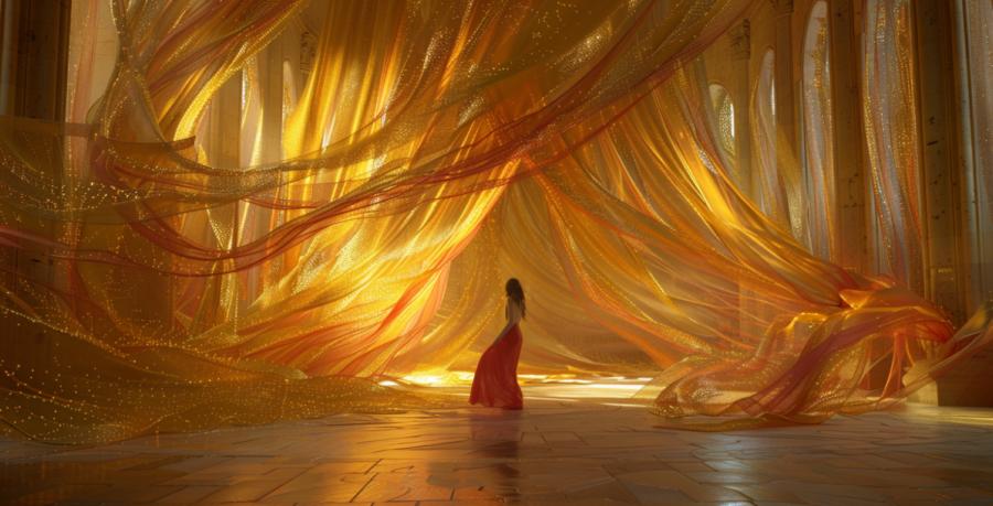
Gold Without the Gaudy
Gold is the ceremonial algorithm: it boosts perceived value of anything it touches and, inconveniently, can also blind the witnesses. Neurologically, metallics trigger attention like a small, tasteful thunderclap. Culturally, gold connotes prosperity, divine favour, and a sly memory of sunlight in monsoon months. The goal is radiance, not reflective signage.Keep metals near motion—borders, cuffs, dupatta edges—so light dances rather than stalls. Pair with maroon for stability, with mint for lift, with saffron for heat management. If the venue lighting is LED-cold, favour warmer gold threadwork or champagne tones; if the hall runs amber, step down the saturation or everything turns into a dessert trolley.
Mint, the Soft Reboot
Mint arrives like a breeze through a crowded mehndi: brisk, polite, faintly medicinal in the best way. Psychologically, pale greens reduce stress and increase feelings of renewal; culturally, they lean into spring weddings, fresh starts, and that aunt who insists on "something light for once." Mint rescues ensembles from over-earnestness and pairs beautifully with silver, rose-gold, or very disciplined gold. It can wash out under harsh daylight; solve with texture—chikan, sheerness, or a tonal jacquard—to add depth without muting the freshness.For stylists: mint works as a diplomatic backdrop for louder jewellery. It also calms busy prints, contains maximalist florals, and forgives late-night dessert choices. Keep makeup warm so faces don't drift into the mint and apply contrast at the lash line or lip to anchor expressions in photos.
Saffron and the Heat of Celebration
Saffron is a color that behaves like it owns a drum. It hums with energy, simultaneously sacred and theatrical, the perfect middle ground between asceticism and afterparty. In South Asian psychology, saffron's lineage is saintly—it's the robe of renunciants and revolutionaries alike—but in fabric form it vibrates with joy. Its yellow-orange wavelength stirs optimism and appetite, which explains why guests hover near anyone wearing it, subconsciously expecting snacks.Used well, saffron can anchor a ceremony in vitality. Too little and the effect is hesitant, like a whispered blessing. Too much and the event resembles a food commercial. Stylists often dilute it through ombré, chiffon overlays, or strategic pairing with ivory or teal. It's the spice of the palette: indispensable in moderation, catastrophic in bulk.
Color Combinations that Behave Themselves
Psychological harmony in clothing relies on how colors converse, not compete. South Asian ceremonial palettes, when well-judged, stage these conversations elegantly. A few pairings with excellent manners:- Maroon and Gold – gravitas meets luminosity; traditional yet cinematic.
- Mint and Blush – serene, airy, and kind to nervous grooms.
- Saffron and Cream – devotional warmth with daylight insurance.
- Gold and Teal – confident luxury; requires a firm hand and good posture.
Cultural Memory in Fabric Form
Each hue arrives carrying history on its sleeve. Maroon carries the sindoor and the bridal veil. Gold recalls the gods and the dowry, sometimes uncomfortably. Mint arrived with colonial textile exchange, evolving from medicinal pigment to aspirational modernity. Saffron, ancient and restless, has fluttered between temple and protest banner. To wear any of these colors is to be in quiet dialogue with that past—sometimes proudly, sometimes by accident.In diaspora ceremonies, these meanings get remixed. A second-generation couple in Chicago might choose mint for "minimalism," unaware they've stumbled into a thousand years of spring symbolism. A bride in Manchester may reject red for personal taste, not realising she's participating in a gentle rebellion that began with Bollywood's flirtation with pastels. That's the real delight of color psychology in fashion: its motives are both personal and inherited, tangled but alive.
Dye Another Day
Color, at its most persuasive, tells a story faster than language. Ceremony wear compresses joy, lineage, anxiety, and social aspiration into silk and thread. What looks like decoration is really coordination—between the heart rate, the heritage, and the hope that everyone's phones capture you in flattering light.Maroon steadies, gold amplifies, mint soothes, saffron ignites. Each has a pulse, a posture, a way of reminding us that celebration is not just about occasion but perception—the chemistry between cloth and consciousness. Whether you're designing the collection, styling the shoot, or merely deciding which outfit won't upstage the bride, remember: in the psychology of celebration, color doesn't just set the mood. It decides who gets remembered.
Article kindly provided by rangreza.net
Latest Articles
- From Shop Floor to Storyboard: What Retail Spaces Can Teach Fashion Photographers
- The Quiet Luxury Test: How to Tell When Design Is Doing the Talking
- Using Location as a Fashion Storytelling Tool
- Why Modern Style Is Becoming More Regional Instead of Global
- How Small Communities Quietly Became the Biggest Driver of Custom Clothing Culture
- How Climate Should Influence Your Wardrobe More Than Style Trends
- The Fit Illusion: Why Two Identical Sizes Can Feel Completely Different
- Micro-Fragrance Wardrobes: Why Owning 5 Small Bottles Can Beat 1 Big Signature Scent
- Why Your Wardrobe Feels Wrong Even When It Looks Good
- Capturing Real Emotion Without Telling Anyone to Smile
- Fashion Forward: Emotional Storytelling in Technical Cultures
- The Psychology of Tattoo Aesthetics: Why Certain Imagery Resonates
- Style That Works With Your Body, Not Against It
- Fashion Tourism on Wheels: Curated Shopping Routes Led by Chauffeur Guides
- The Charm of Certainty in a World of Indecision
- Can an Everyday T-Shirt Be Turned into a Modern Heirloom?
- Color, Ceremony, and the Psychology of Celebration
- Styling Graphic T-Shirts for Different Body Types
- Getting Kids to Wear Their Hats Without a Bribe or a Meltdown
- Mastering the Art of Being the Unnoticed Photographer
- Accessories
- Jewellery
- Footwear
- Skirts and Dresses
- Shirts and Blouses
- Beauty and Makeup
- Fashion Photography
- Sustainable Fashion
- Street Style
- Fashion History
- Fashion Business
- Fashion Styling
- Fashion Events
- Plus-Size Fashion
- Men's Fashion
- Women's Fashion
- Fashion Blogging
- Fashion Trends
- Fashion Retailers
- Fashion Tips and Advice
- Fashion Business Startups
- Fashion Around the World
- Lingerie
- Sportswear
- Weddings